| Sneak Peek: Super Happy Go Go Ninja Time | 01:57 PM -- Thu July 21, 2005 |

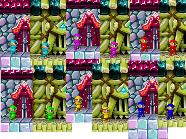
Here's a new Sneak Peek twist! I'm looking for your opinion. I needed to modify the look of the ninja so he would stand out well against these colorful backgrounds, so here are some color schemes I tried (each one shown against the two different background types that currently exist). They're quite vibrant, aren't they? What do you like? What will work well against a wide variety of backgrounds? Which ones don't seem to stand out at all?
| 18 comments | Back to top! |
Copyright 2021-2023, Hamumu Games Inc.

