| Sneak Peek: Loonyland II: Winter Woods | 03:42 PM -- Wed March 1, 2006 |

So much new stuff! I spent the past week doing nothing but new graphics, and here are some.
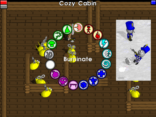
First, let's talk tiles. The tiles in this shot are the new cabin tiles. I'm still working on them, and the reason the floor is so ugly is that the floor is actually a 2x2 tile thing, but I didn't bother to fill it in properly in this map. I just splashed down one of its tiles over the whole place. If you look in the upper left, you can see a bit of what it's supposed to be - relatively long boards (the leftmost one is longer than it's supposed to be, ignore that), like your typical wooden floor. This is kind of my first foray into making 3D models and turning them into tiles, which is tricky business, I'm finding. Even the floor is actually 3D shapes.
But you're not even looking at the tiles, you're mesmerized by the splendiforously colorful icons in a big circle! Those would be the spell icons (and a blank one for 'cancel' and the handy throwing/melee axe toggle). You are welcome to guess what the spells are, but I'm not telling. You'll have to earn them in the game! I currently have my favorite-named one highlighted. As you can see, there are 5 types of magic, and each is a different color, and has 3 spells in it. This ring pops up, pausing gameplay, when you hold down the magic button, and you press left and right to rotate through the spells and let go to cast it. You can also just tap the button to cast the same spell you did last. I need to add a black outline around the spell name though, to make it more legible.
Inset, we have a shot of two Tinny Tims, the lowliest of the Tin Soldier enemies. As you can see, their guns are too powerful for them to handle, and they practically fall over backwards firing them. The smoke behind the fireball is from the tip of the gun, if you didn't get that. It looks cool in action, poofing out in a ring. The fireball is way overbright, which is mainly the fault of the snow being too bright. I am going to have to tone the snow down somehow, which will be hard to do without making it look dirty.
And lastly, there are new interface goodies! As you can see, your Life and Stamina are on the upper left, and your Magic is on the upper right. In the middle, you get told what area you're in, unless you recently picked up some money, in which case your current money total is shown instead. When you hit enemies, their life meter shows up in the lower right. And as you have seen in previous shots, important messages pop up in the lower left. So every corner's got something to offer you, but most of the time, most of the screen is just gameplay. I squeezed those meters way into the corners to maximize screen space. I fiddled with a bunch of different fancy 3D life meter styles, but this simple style is my favorite. Totally basic, does the job. They will probably stay like this.
There are a ton of other graphics I made which aren't shown here - tables, chairs, dressers, beds, bullets, items, signs, and even villagers. Artwork is a horrifyingly large portion of the work on this stuff. You wouldn't believe how many individual little visuals it takes to make even a simple in-game scene. And each one has to go through a series of conversion steps in no less than 3 different programs before I actually begin coding it into the game itself. Games is hard.
| 10 comments | Back to top! |
Copyright 2021-2023, Hamumu Games Inc.

